
Home » plausibility testing
Category Archives: plausibility testing

WTF! Introducing the wellness industry’s Wishful Thinking Factor

Finally! A valid way to measure wellness outcomes that requires only a calculator, a triple-digit IQ, and complete suspension of disbelief! Introducing the Wishful Thinking Factor, or WTF. Those of you accustomed to reviewing wellness vendor outcomes may think those initials stand for something else…and we will indeed use those initials in their more common context at the end of this posting.
By contrast, this WTF is defined as:
Dollars claimed as savings/percent improvement in risk factors.
The elegance of the WTF is exceeded only by its widespread acceptance. WTF is already the wellness industry’s preferred analysis, so I am merely confirming that we agree. The only difference between my WTF calculation and theirs is they don’t actually put the numerator and denominator on the same page.
Meaning, they don’t actually announce: “Here’s our huge savings generated by our trivial risk reduction…wait…this is impossible…WTF???”
That’s because then it would be perfectly obvious that they are fabricating the savings. Instead they put “dollars saved” on one page and the improvement in risk factors on another page, way far away — and hope nobody compares them. (Interactive Health is the most stable genius example of that, as we’ll see below.)
What is the real causal relationship between risk reduction and savings?
A distressingly relevant joke circulated among us rip-roaringly hilarious faculty back when I taught in the Harvard economics department. A chemist, physicist and economist are stranded on a desert island with only a can of beans. To open it, the physicist suggests dropping it off a cliff, so that it will open upon impact. The chemist points out that would splatter the contents, and suggests instead that they put the can in a fire, and once the can gets hot enough, it will melt. The physicist points out that the beans would all burn up in the fire. At an impasse, they turn to the economist and ask what he would do.
The economist replies: “Assume a can opener.”
In keeping with that spirit, we will make six (count ’em, 6) equally generous assumptions for determining the true WTF:
- Every wellness-sensitive medical admission or ER visit is a direct function of the risk that the wellness vendor measures in a population. In other words, social determinants of health and genetics have nothing to do with the likelihood of a heart attack or diabetes event
- Even the dumbest wellness vendors know how to measure risk (following their five days of training in medicine)
- Employees never cheat to improve their biometric scores and never lie on their risk assessments
- Dropouts and non-participants would improve in risk at the same rate as participants do, so the fact that they don’t participate doesn’t change the overall risk reduction in the population
- No lag time between risk reduction and event avoidance
- No false positives, no added lab tests, drugs, doctor visits or anything else that might possibly increase utilization and cost of outpatient care in order to reduce inpatient utilization — which of course is the opposite of what the wellness trade association readily admits to:

Using those generous assumptions, measured wellness-sensitive medical admissions (WMSAs), and the total cost of those events, would decline at the same rate as measured risk declines. According to the Health Enhancement Research Organization, WSMAs comprise no more than $100 PEPY in a commercially insured population. So every 1% decline in risk yields a spending decline of $1.
Relaxing the assumptions above would likely reveal that this WTF is also overstated, but it has the advantage of consensus among the 60+ experts who contributed to the HERO outcomes guidelines measurement tool, so we’ll call this the Gold Standard, to which other WTFs are compared.
Now let’s make a little list of the WTFs compiled by the industry’s very stable geniuses, in their great and unmatched wisdom. Naturally, in that category, the first to come to mind are Interactive Health and Ron Goetzel.
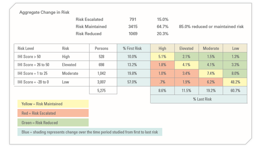
Let’s start with Interactive Health. Excluding dropouts and non-participants, they claimed a 5.3% risk reduction (20.3% reduced risk while 15% increased them). So they saved a maximum, assuming the six assumptions above, $5.30 PEPY:
The claimed savings was:

Averaging those claims yields $804, for a WTF of 151.
As a side note, allocating that $804 in savings across the 5.3% who actually did see a decline in risk factors yields over $15,000 per risk factor reduced. No mean feat when you figure that the average person only incurs about $6000 in employer spending. That was enough to get them in the Wall Street Journal
A second example (and there are many more) is the Koop Award given to Health Fitness Corporation for lying about saving the lives of cancer victims who never had cancer. The coverup of that fabrication was the lead story about Nebraska, along with whether Ron Goetzel had committed an actual crime, as opposed to simply snookering the rather gullible state, whose reaction when they found out is best described as Human Resources-meets-Stockholm Syndrome.
Mr. Goetzel defended his actions by saying that lying about saving the lives of cancer victims was overlooked by the awards committee, and what really earned Nebraska the award was saving $4.2 million by reducing 186 risk factors. Let’s calculate the WTF from that.

the absolute reduction in risk was 0.17 (1.72 to 1.55) on a scale of 7, or roughly 2.4%. That represents about 180 people out of 5199 reducing a risk factor. (Of course, the remaining 15,000 of the 20,000+ state employees dropped out and/or wanted nothing to do with this program, but that’s a different story. So much winning!)
And yet somehow, despite only 180 people claiming to reduce a risk factor, the program saved $4.2-million, or $807 apiece for the total 5199 people. That yields a WTF of 336.
Speaking of Koop Awards, The Koop Award Committee is known for its embrace of WTF arithmetic, and it’s that time of year again during which they put their very good brains on full display. For instance, they once gave an award to Pfizer for saving $9 million, or roughly $300 per employee. How did Pfizer do that? With a 2% risk factor decline. Pfizer’s WTF worked out to about 150.
As a sidebar, Pfizer’s award application includes our all-time favorite displays:
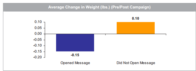
Pfizer’s wellness team sent employees emails on weight control tips. Those who opened the messages lost about 3 ounces while those who did not open the messages gained 2 ounces. That could easily be accounted for by the number of calories required to open the emails.
The 2019 Koop Award
Most recently, the very stable geniuses just gave an award to Baylor Medical School, where, in keeping with tradition, risk factors declined by a whopping 1% — at least among the 25% of the workforce willing to be screened twice (!!!) a year to earn a 20% premium reduction. Let’s take a looksee at the biometric screening results:

On average, these five categories improved 1.04%, to be exact. This is actually quite an accomplishment for the vendor, Vitality, which typically gets no improvement or a deterioration.
The claimed savings — in keeping with Koop Award tradition, buried deep on another page — were $333/year, yielding a WTF of 320.
For any readers out there with the IQs of a Koop Award Committee member, let me spell out the pattern you’re seeing: the wellness industry’s own data yields WTFs 150 to 336 times greater than the wellness industry’s own guidebook estimates.
If anyone would like to reach me to review this arithmetic, or report their own vendor’s results, contact me directly. Schedule-wise, I’m not available today (Monday) or Tuesday. However I am available later this week, specifically WTF.
Share this:

Measuring wellness outcomes using ingredients you already have in your kitchen
This is Part 2 in the series on plausibility-testing and measuring ROI of wellness-sensitive medical events. No vendors or consultants are being “outed” in this posting, so if you read TSW for the shock value, you’ll be disappointed. But of course you don’t do that — you read TSW to gain insight and knowledge. Yeah, right, and you used to subscribe to Playboy for the articles.
In the previous installment, which should be reviewed prior to reading this one, we listed the ICD9s and ICD10s used to identify and measure wellness-sensitive medical events. You want to count the number of ER visits and inpatient stays across these diagnoses, the idea being that this total should be low and/or declining, if indeed wellness (and disease management) are accomplishing anything.
This total is never going to fall to zero — people will always be slipping through the care and especially self-care cracks — but the best performing health plans and employers can manage the total down to 10-15 visits and stays per year. To put this in perspective, incurring only 10 ER and IP claims a year per 1000 covered people for wellness-related events is a great accomplishment, given that you have about 250 ER and IP claims/1000 covered people for all-causes combined. That would mean only about 5% of your claims are wellness-sensitive. If hospital and ER spending is about 40% of your total spending, that would mean your spending on events theoretically avoidable by wellness programs represents about 2% of your total spending. (So much for the CDC’s rant that 86% of your claims are associated with chronic disease. This from the people who are head-scratchingly alarmed by the “arresting fact” that “chronic disease is responsible for 7 out of every 10 deaths.” And yet these guys somehow wiped out polio…)
When you count these codes, there are a number of mistakes you could make, but shouldn’t, if you follow this checklist. It’s really very easy, meaning that many mistakes are the result of overthinking the analysis.
Think of it this way: if you were estimating a birth rate, you wouldn’t look at the participants in your prenatal program, or count how many women made appointments with obstetricians. You’d simply tally the number of babies born and divide that figure by the number of people you cover. Each potential mistake on this list is avoidable by keeping that example in mind.
I’ve got a little list
- Do not “count” the number of people (two discharges for one person equals one discharge for two people), and do not take into account whether people were in a disease management or wellness program.
- Do not count people for whom you are secondary payer.
- If someone has an event straddling the year-end, count them in the year of discharge
- Don’t be concerned with taking out false positives; they will “wash”
- If someone is transferred and has an applicable primary diagnosis both times, they count twice. (This should happen automatically.)
- If someone has (for example) a heart attack and an angina attack in one hospitalization, only the primary code counts
- Admissions following discharges count separately if they generate two different claims forms
- Interim submissions of claims or claims submissions replaced by other claims submissions should only be counted once (since they represent only one hospital stay)
- Admissions made through the ER, of course, do not count as ER visits
- Claims may include facility and professional. Remember to only count facility and not professional claims – otherwise it is double-counting
- Urgent care is not the same as ER. ER includes just (1) ER PLACE OF SERVICE and (2) OBSERVATION DAYS.
- All ACUTE CARE hospital admissions count, including <24 hours, and EXCLUDING observation days, which we count with ER.
- Allowed claims, not paid claims
- Fiscal year or Calendar year is fine — most people use fiscal year
- Be careful that your case-finding algorithm notes that sometimes IP admissions from the ER take place the day after the ER admission (like at night)!
- Go back as many years as is conveniently trackable. The more years you go back, the more insight you will glean from the analysis.
- For ER discharges, include all submissions whether non-emergent or emergent
- Do NOT count members >65 in the “commercial” category even if you are primary-pay. (That would mess up your comparisons.)
Share this:

How to Plausibility-Test Wellness Outcomes (not as boring as it sounds)
Suppose your family is enjoying dinner one night and your daughter’s cell phone rings. She excuses herself, goes in the other room for a few minutes, comes back out and announces: ‘‘Mom, Dad, I’m going over to Jason’s house tonight to do homework.’’
No doubt you reply, ‘‘Okay, bye. Have a nice time.’’
Ha, ha, good one, Al. Obviously, you don’t say that. You say: ‘‘Wait a second. Who’s Jason? What subject? Are his parents home?’’ Then you call over to the house to make sure that:
- adults answer the phone; and
- the adults who answer the phone do indeed have a son named Jason.
You are applying a “plausibility test” to your daughter’s statement so instinctively that you don’t even think, let alone, say: ‘‘Honey, I think we need to test the plausibility of this story.’’ That’s everyday life. Plausibility-testing would be defined as:
Using screamingly obvious parental techniques to check whether your kids are trying to get away with something.
The general definition of plausibility-testing in wellness
Not so in wellness, where employers never test plausibility. (It’s amazing employer families don’t have a higher teen pregnancy rate.) In wellness, plausibility-testing is defined as:
Using screamingly obvious fifth-grade arithmetic to check whether the vendor is trying to get away with something.
You might say: “Hey, I majored in biostatistics and I don’t remember learning about plausibility-testing or seeing that definition.” Well, that’s because until population health came along, plausibility testing didn’t exist because there was no need for it in real grownup-type biostatistics. In real biostatistics studies, critics could “challenge the data.” They could show how the experiment was designed badly, was contaminated, had confounders, had investigator bias, etc. and therefore the conclusion should be thrown out.
The best example might be The Big Fat Surprise, by Nina Teicholz, in which she systematically eviscerates virtually every major study implicating saturated fat as a major cause of heart attacks, and raises the spectre of sugar as the main culprit. This was two years before it was discovered that the Harvard School of Public Health had indeed been paid off by the sugar lobby to do exactly what she had inferred they were doing.
What makes wellness uniquely suited to plausibility-testing is because, unlike Nina, you aren’t objecting to the data or methods, as in the case of every other debate about research findings. Rather, in wellness plausibility-testing, you typically accept the raw data or methods — but then observe they prove exactly the opposite of what the wellness promoter intended. You do this even though the raw data and methods are usually suspect as well. For instance, dropouts are not only uncounted, and unaccounted for, in almost all wellness data. Indeed with the exception of Iver Juster poking the HERO bear in its own den, their existence is generally not even acknowledged. As an Argentinian would say, they’ve been disappeared.
Flunking plausibility is part of wellness industry DNA, the hilarity of which has been covered at length on this site, as recently as last week with (you guessed it) Ron Goetzel. I did have to give him some credit this time, though: usually a plausibility test requires 5 minutes to demonstrate he proved the opposite of what he intended to prove. This time it took 10.
And of course the best example was Wellsteps, where all you had to do was add up their own numbers to figure out they harmed Boise’s employees. You didn’t have to “challenge the data,” by saying they omitted non-participants and dropouts, that many people would likely have cheated on the weigh-ins etc. All those would be true, but they wouldn’t face-invalidate the conclusion the way that plausibility test did.
The specific definition of plausibility-testing using wellness-sensitive medical admissions
All of what you are about to read below, plus the story about Jennifer (which ends happily — it turned out Jason was home, they did do homework…and later on they got married and had kids of their own, whose plausibility they routinely check), is covered in Chapter 2 in Why Nobody Believes the Numbers. This adds the part about the ICD10s.
There is also a very specific plausibility test, in which you contrast reductions in wellness-sensitive medical event diagnosis codes with vendor savings claims, to see if they bear any relationship to each other. The idea, as foreign as it may seem to wellness vendors, is that if you are running a program designed to reduce wellness-sensitive hospitalizations and ER visits, you should actually reduce wellness-sensitive hospitalizations and ER visits. Hence that is what you measure. Oh, I know it sounds crazy but it just might work.
And it’s not just us. The Validation Institute requires this specific analysis for member-facing organizations. They were adopted for a major Health Affairs case study on wellness (that didn’t get any attention because it showed wellness loses money even when a population is head-scratching unhealthy to begin with). And even the Health Enhancement Research Organization supported this methodology, before they realized the measuring validly was only a good strategy if you wanted to show losses.
Quizzify plausibility-tests its results in this manner and guarantees improvements, but because Quizzify reduces many more codes than just wellness-sensitive ones, the list of diagnosis codes below would be much-expanded. But the concept is the same.
The remainder of this post and (barring a “news” event in the interim) the next posting will show how to do a plausibility test. Today we’ll start with which codes to look at. Part 2 will be how to avoid common mistakes. Then we’ll cover how to compare your results to benchmarks. Finally, we’ll show how to estimate the “savings” and ROI.
Codes to be used in a plausibility test
Start by identifying codes that are somewhat closely associated with lifestyle-related conditions and/or can be addressed through disease management. These are the ones where, in theory at least, savings can be found. Here are some sample ICD9s and ICD10s. In order to save space since this source data doesn’t reproduce well in WordPress, I can’t put the codes next to the conditions. Instead, I’ll stack ’em in the following order:
- asthma
- CAD
- CHF and other lifestyle cardio-related events
- COPD
- diabetes
ICD9s are stacked in the same order:
| 493.xx (excluding 493.2x*) |
| 491.xx, 492.xx, 493.2x, 494.xx, 496.xx, 506.4x |
| 410, 411, 413, 414 (all .xx) |
| 249, 250, 251.1x, 252.2x, 357.2x, 362, 366.41, 681.1x, 682.6, 682.7, 785.4x , 707, 731.8x |
| 398.90. 398.91, 398.99, 402.01, 402.11, 402.91, 404.01, 404.03, 404.11, 404.13, 404.91, 404.93, 422.0, 422.9x, 425.xx, 428.xx, 429.xx |
ICD10s, ditto in order, are:
| J45 |
| J40, J41, J42, J43, J44, J47, J68.4 |
| i20, i21, i22, i23, i24, i25.1, i25.5, i25.6, i25.7 |
| E08, E10, E11.0-E11.9, e16.1, e16.2, e08.42, e09.42, e10.42, e11.42, e13.42, e08.36, e09.36, e10.36, e11.311, e11.319, e11.329, e11.339, e11.349, e11.359, e11.36, e13.36, L03.119, L03.129, i96, E09.621, E09.622, E11.621, E11.622, E13.621, E13.622, L97 |
| i50, i10, i11, i12, i13 |
The ICD9s and ICD10s are not a perfect match for each other. If ICD10s matched ICD9s, there would be no need for ICD10s. If you try to construct an events trendline crossing October 1 2015, when the ICD10s were adopted, you might find a bump. More on that another time.
Coming up next: So now that you have these ICD9s, what do you do with them?
