
April fools!
What follows is an analysis of all hospitalizations in the US from 2001 to 2014. Wellness–punitive, health-contingent wellness in particular–has apparently harmed more employees than it has benefited. Here’s the story in one simple graph, comparing the percentage of the hospital admissions that are wellness-sensitive (diabetes, heart attacks) to all hospital admissions. The blue line reflects that calculation for admissions covered by private (commercial) insurance, while the orange line combines Medicaid, Medicare and uninsured. They will have higher absolute rates of these events but it’s the difference of differences that matters:

What can we learn from this analysis?
- The point-to-point change is -.3% in the non-exposed population (orange) vs. +.1% in the exposed population (blue).
- The difference of differences should be going in the opposite direction, since essentially every known major factor that could impact this blue line more than the orange line is held constant, other than an increasing penetration of workplace wellness into the blue-line population. Spending about $6 billion more on wellness services in 2014 (vs. 2001) should have made a huge favorable impact on the blue line, given that the total spent on inpatient wellness-sensitive medical events in 2014 was roughly $7 billion, applying the Health Enhancement Research Organization’s estimate of $25,000/admission to the 285,000 relevant 2014 admissions.
- It’s actually worse. Only about half the employed population has access to screening and risk assessments, meaning that the size of the industry overwhelms the size of the addressable events even if one assumes that all the diagnoses leading to the events were found in screenings.
- It might seem absurd to assert that the wellness industry in total (almost $8 billion today) is double the size of the healthcare spending it is supposed to address, but a “bottoms-up” analysis gives the same answer: In the privately insured population, 4.1% of admissions were wellness-sensitive in 2014. Figure half these events take place in people who already know they are at risk or have the diagnosis. So 2% of all admissions involved employees who did not know they had the diagnosis when they had the event — and hence could conceivably have learned about it and avoided it through a wellness program. Admissions are about half of all costs, meaning 2% of admissions would consume 1% of costs. 1% of a typical $6000/individual employee spend is $60/employee/year. A wellness program, including the screening, likely costs $150. That means even a perfect program — one that finds every employee with a hidden diagnosis, avoids all false positives, and prevents every event without any added cost of prevention therapy– would lose money. Alas, as lovingly documented on this website through the years, a beam of light leaving “perfect” wouldn’t reach the “pry, poke and prod” industry for several seconds.
- The fairly dramatic upswing starting in events in the exposed population (the blue line) starting in 2012, even as the rest of the country was almost leveling off, correlates quite closely with the move towards health-contingent, or “outcomes-based” wellness, in which employees who don’t crash-diet hard enough before the final weigh-in get fined. So while a study by Redbrick showed no benefit to health-contingent programs, the truth is likely worse: many health-contingent programs actually do harm, as Interactive Health recently demonstrated and for which Wellsteps won a “best-in-industry” award. Much is this harm is visited upon employees with eating disorders.
In case you don’t believe punitive wellness programs could be this bad…
You can ask me for the raw data, and/or replicate this exact analysis, using ingredients you already have in your kitchen — an internet connection (which perhaps even Bravo has acquired by now) and the links below.
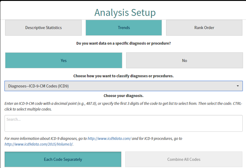
It happens that the nation’s hospital admissions data (through 2014) is all publicly available online. You can see for yourself how badly wellness has failed. First, go to the admissions database. Then under “Analysis setup” go “Trend>yes>yes.” That will bring you to a dropdown menu asking you to “choose how you want to classify the diagnoses or procedures.” Pick “Diagnosis ICD-9-CM codes.”
It will ask you to “Choose your diagnosis.” This is where it gets slightly labor-intensive. You’re gonna want to pick all the heart attack and uncomplicated diabetes codes, since those two categories represent by far the lion’s share of wellness-sensitive medical events (WSMEs), events that can be theoretically avoided through screening the stuffing out of employees. You might ask: “Why not include complications of diabetes, and heart failure etc.? Why just these two?”
That’s because we aren’t testing disease management. We’re testing to see if “playing doctor” to try to hunt for disease is worthwhile. Anyone with complications of diabetes, or a more serious condition like heart failure or COPD, obviously already knows they have it. No screen needed. We also can’t test stroke because the HCUP data prior to 2012 has some squirelliness in it. (In any event, there are far fewer strokes in the working age population than heart attacks, especially if one excludes those where atrial fibrillation was the likely cause.)
Diabetes and heart attack ICD9s begin with 250 and 410 respectively. Once you enter one of those 3-digit codes into the field, a ton of 5-digit codes will show up. Just keep hitting “CTRL click” until they all show up in the field. Then, hit “combine all codes.” Here is what the screen will look like before you do that:
After you enter these diagnoses, choose “Combine all codes” and then “Create analysis.” You’ll get a screen that looks like this. Do not attempt to adjust your TV set. I am just showing you this so you know you’re in the right place, not to try to see the results:

Once you’ve gotten to this point, you need to split the analysis into payer category and then pick multiple years, to show a trend. To find the payer, use the left-hand navigation bar and go to Patient Characteristics>Payer. You’ll want to do multiple years, and farther down that toolbar you’ll see “years.” You just check all the years from 2014 back to 2001 and hit “submit.” (There is some squirreliness in the years before 2001.)
Doing this by payer is critical. Almost every employee with access to workplace wellness will be commercially insured — or as HCUP puts it, privately insured.

You’ll then get a screen that looks like this:
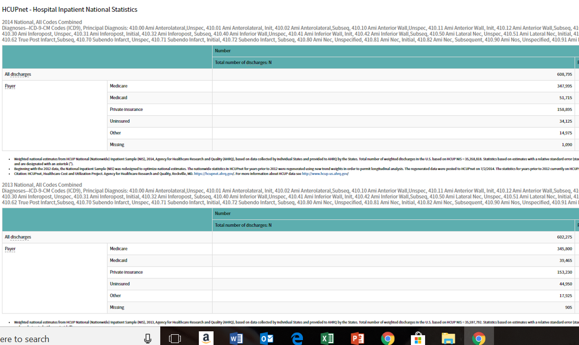
It will give you all the admissions, by payer, for all the years. You are then given an option to drop this into Excel, an option you should take. (This is the definition of “voluntary,” by the way. Your employer won’t fine you if you don’t.) Once it is in Excel, you can copy-and-paste the actual year-by-year data into an easy-to-use format, like this little snippet that lists stroke-hypertension and then repeats the format for all admissions:”All admissions” becomes the denominator for those 15 years, split into “private insurance” (where over those 15 years members had gained increasing access to wellness programs) vs. the other five categories combined, which did not have wellness access.
After you complete this analysis, you will find that the reason I offered a $3 million reward to show wellness saves money is because there is no chance of anyone ever being able to claim it.


The blue line does appear to correlate quite nicely with the Affordable Care Act coming online. It would only make sense that the increase in the number of people being admitted shows up on the commercial side due to the influx of people into the commercial payor group thanks to the ACA. My understanding of the initial research into the ACA found that the newly insured members were also sicker than they were initially thought they would be, so the overall increase in hospital admissions makes sense from that perspective as well. Since you stated you controlled for all the variables that could be driving the up trend in the blue line except for participation in a worksite wellness program, I am assuming the variables you controlled for included employment status and another was length of time being insured. Correct? Since not all wellness programs are created equal, how are you differentiating between programs that screen and those that do not, or are you lumping them both together for the sake of this example? Thanks. -Bill
LikeLike
Answer is, I’m not. If you take out that “surge,” as you insightfully suggest (and I confess I hadn’t thought of), the two lines are roughly parallel, which is what you’d expect. There is just no impact. When you apply what eventually grew to $8 billion of prevention to $8 billion of admissions, you should see an impact, increased separation, that doesn’t require a magnifying glass to discern. If I did what you described, you might find either parallel lines, as mentioned, or a slight separation, which would be nowhere near enough to pay for the intervention.
You are one of the few people who can inspire me to actually do more analysis, so I went back and looked at the trendline for the uninsured, which increased steadily during the period, unabated during the Obamacare years. So prima facia it looks like your hypothesis, however thought-provoking, doesn’t bear out. Nonetheless, I have no other explanation.
LikeLike